A bird, a logo, and a moment of meaning

Some of you might know I was lucky enough to take a little break earlier in the year and spend some quality ‘me time’ in France. I’ve been back in the swing of things for a little while now, but my mind keeps drifting back to small moments from the trip. One in particular has stayed with me.
The other day, while walking my dogs on the beach, I saw some birds diving for fish offshore, and suddenly I was transported back to France. I’d been walking along the Seine in Paris (I know, lucky me!) when I spotted a bird in the water that made me stop in my tracks. I had a hunch what it was, so I quickly took a video so I could look it up later. I’m not usually much of a bird enthusiast, but this one was different.
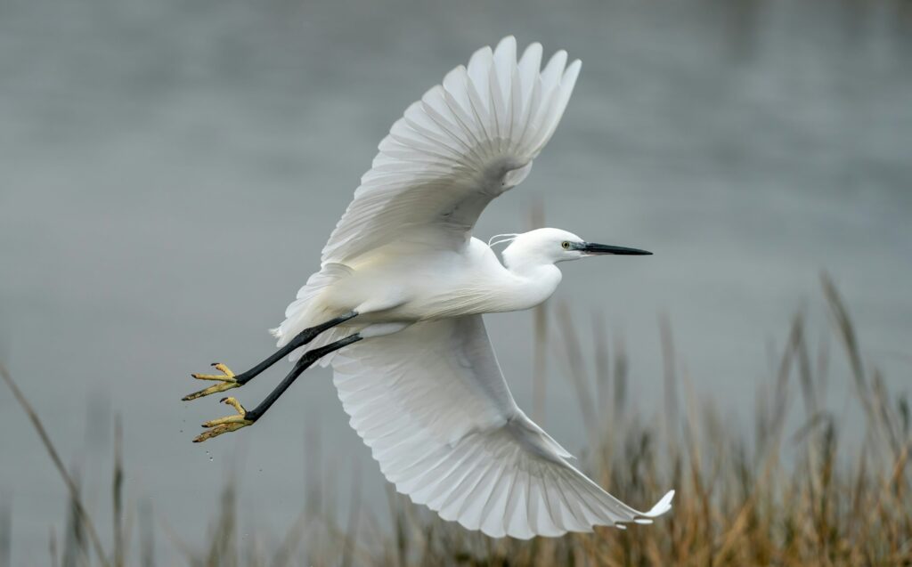
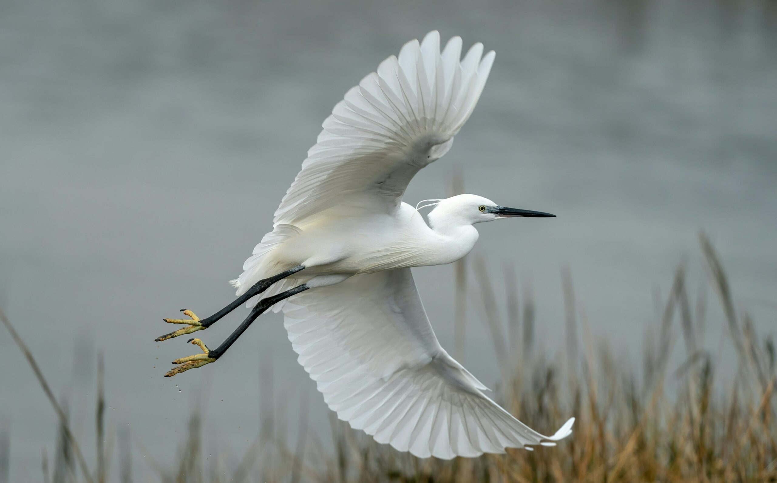
It was a heron, which means it had special meaning to me.
The heron is the inspiration behind our logo at Balanced: Mind Body Life. Our logo isn’t just a pretty design – it’s a symbol of the values and hopes we hold for the people we work with.
Freedom
The first thing the heron represents to us is freedom. Mental health challenges can place heavy limitations on people—restricting where they go, who they connect with, what work they can do. For the clients we work with the most—those with eating disorders—it might mean limitations around what they can eat, how much energy they have, their confidence, or how worthy they feel. These limitations steal more than joy; they can rob people of their time, motivation, finances, and even their sense of self.
Birds embody freedom. They trust their instincts as they move through the world in the air, on the ground, or on the water. They seek out what they need without guilt or shame.
Peace
The second thing we wish for our clients is peace. So many people come to us carrying habits—ways of thinking or behaving—that were developed to bring a sense of peace or safety. But often, these strategies fall short. The peace they bring is fleeting or comes at a high cost. Clients often describe busy, critical minds and a constant internal noise they can’t quiet.
I imagine that, up in the air, things feel quieter. Simpler. There’s space. There’s room to breathe.
Dignity
The third value the heron symbolizes for us is dignity. Reaching out for support – especially to a stranger – can feel incredibly vulnerable. It can make people feel small. But in our logo, the heron is outstretched. It looks powerful. Graceful. Grounded. That’s the feeling we hope we can offer in return for the vulnerability our clients show us: one of empowerment.
Balance
And finally, of course: balance. The triangle formed by the heron in our logo is a long-recognised symbol of balance. Here, we’re not talking about the curated type of “balance” that we sometimes see on social media. What I mean is something gentler – good enough balance. The kind that includes both rest and action, care for others and care for self, play and pause – whatever that looks like for each individual person.
So, next time you see our logo, I hope you’ll see more than a bird. I hope it reminds you of the meaning behind it – the values we try to embody, and the possibilities we believe in for everyone who walks through our doors.
A big thanks to graphic designer Stephanie Albares, who poured so much thought and care into bringing our heron to life.
– Meg

